Client Concerns and Requests
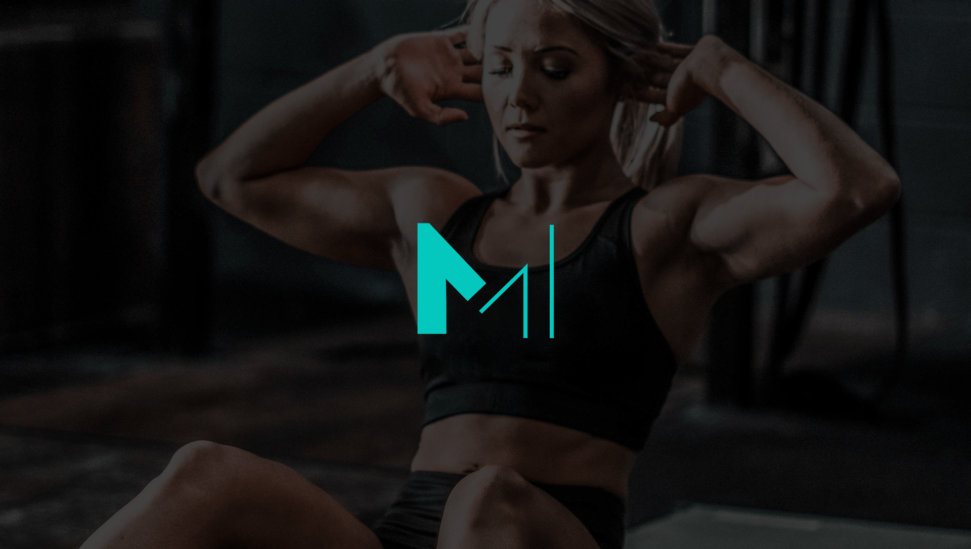
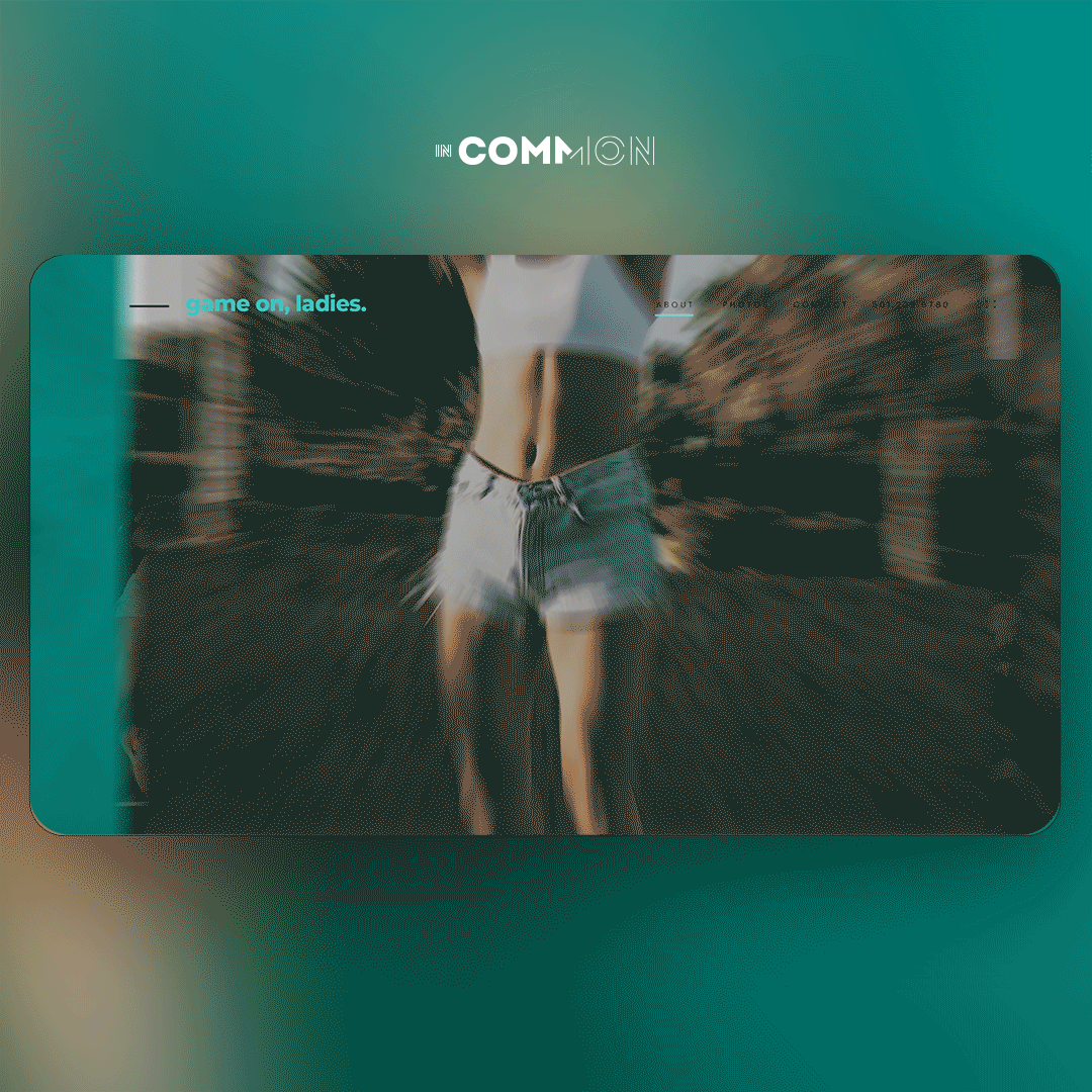
- Name of organization aligns with client’s approach in how she connects with people and how she thinks within her strategic work. She’s always looking for the commonalities and overlap that create connection and relevance
- Show an overlap in the logo somehow to bring the notion of having something “in common” to life
- Use the letter “M” for the logo icon